Back to Portfolio · Marisol Escorza
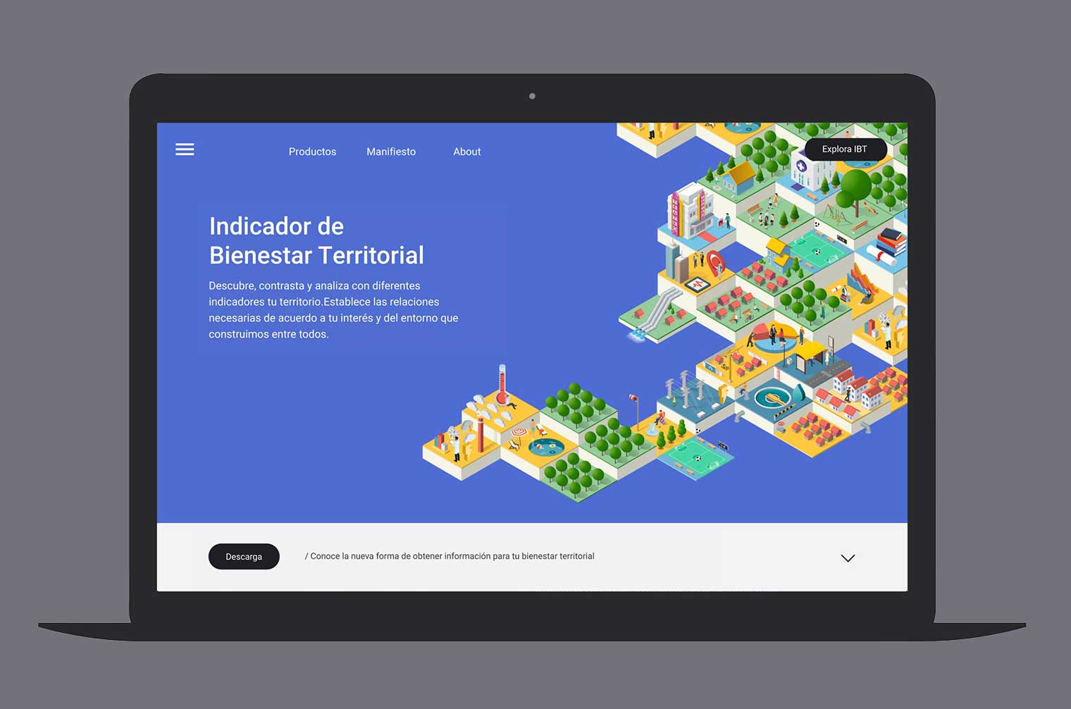
Territorial Wellbeing Index / TWI (IBT) Platform
Reading the territory to make better decisions
Scope
Sector benchmarking
Creative vision and visual narrative
Information architecture
Wireframing & UX flows
Interface design (UI visual system)
Client leadership (CIT-UAI)
Coordination with IT & digital engineering
In 2018, the Territorial Intelligence Center of Universidad Adolfo Ibáñez (CIT-UAI) initiated the creation of a digital platform to visualize wellbeing across Chilean territories. The proposal aimed to make complex scientific data accessible to diverse audiences while also serving as a decision-making tool for public policies with social impact.
As Design Director at Liquid Latam, I led the user experience and interface design of this public tool. I understood that my role was not only to design an attractive interface, but to build a bridge between technical evidence and everyday understanding.
The Challenge
What needed to be solved
When I joined the IBT project, the challenge was not only technical, it was deeply human.
CIT-UAI had developed a rigorous territorial database to measure well-being at the block level. But if that information wasn’t accessible to mayors, community leaders, or municipal teams, it would not fulfill its purpose.
Designing the experience meant translating complexity into understanding. My role as a designer was not simply to create an appealing interface, but to transform a dense information structure into a navigable, accessible, and truly useful experience for decision-making.
How do you translate highly complex territorial data into a tool that people can actually use to decide?

Discover
Explore any city you want, combining indicators freely according to your interests.

Contrast
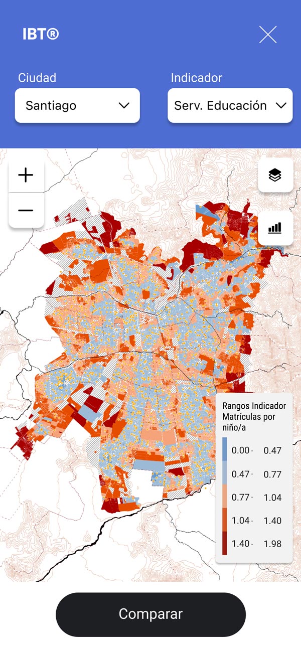
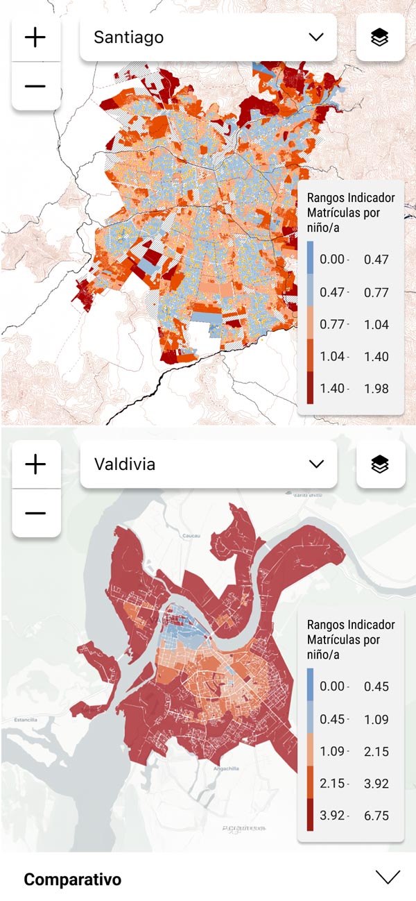
Compare and understand territories by observing them through different indicators.
Scale
Navigate from an entire region down to a single city block; you choose the scale, we provide the data.
Diversify
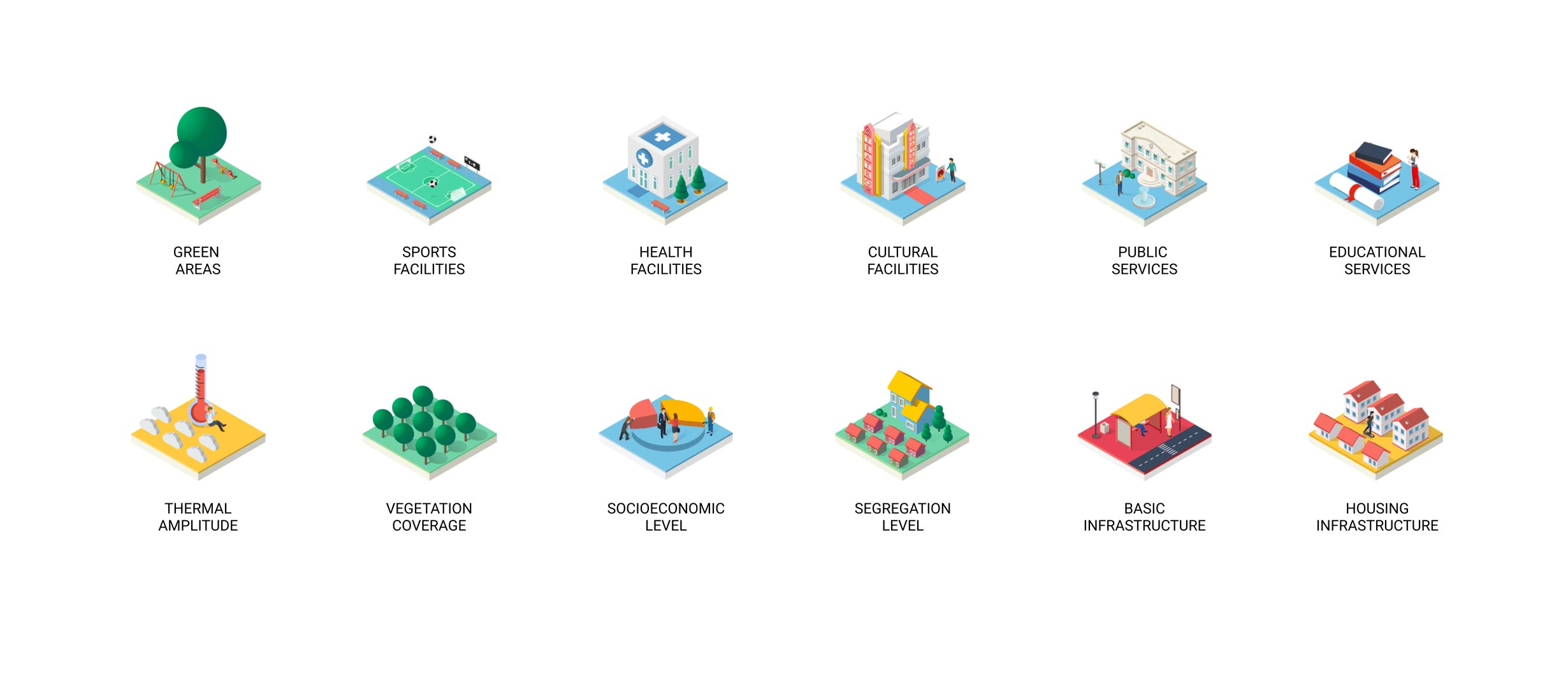
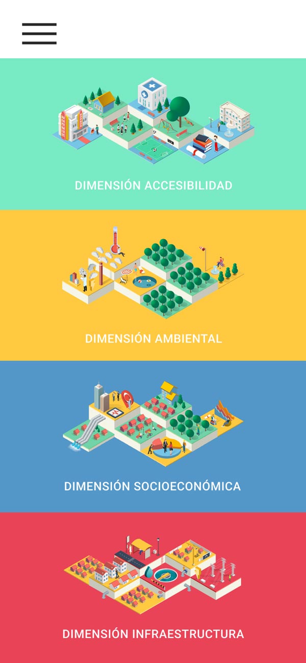
A wide set of indicators allows analyzing the territory from multiple perspectives..
Discover
Explore any city you want, combining indicators freely according to your interests.
Contrast
Compare and understand territories by observing them through different indicators.
Scale
Navigate from an entire region down to a single city block; you choose the scale, we provide the data.
Diversify
A wide set of indicators allows analyzing the territory from multiple perspectives.
My Role
What I did and how I approached it
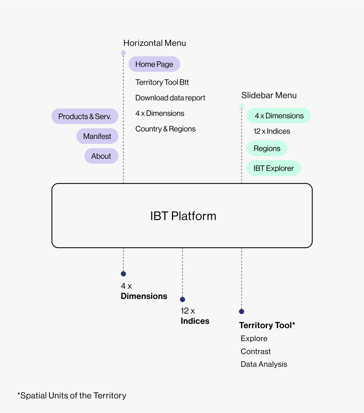
I was responsible for the user experience and interface design of IBT. This included guiding the creative vision, defining the information architecture, designing the visual interface, and leading the relationship with both the institutional client and technical teams. I structured my work around three main focuses:
Guiding the narrative and visual vision
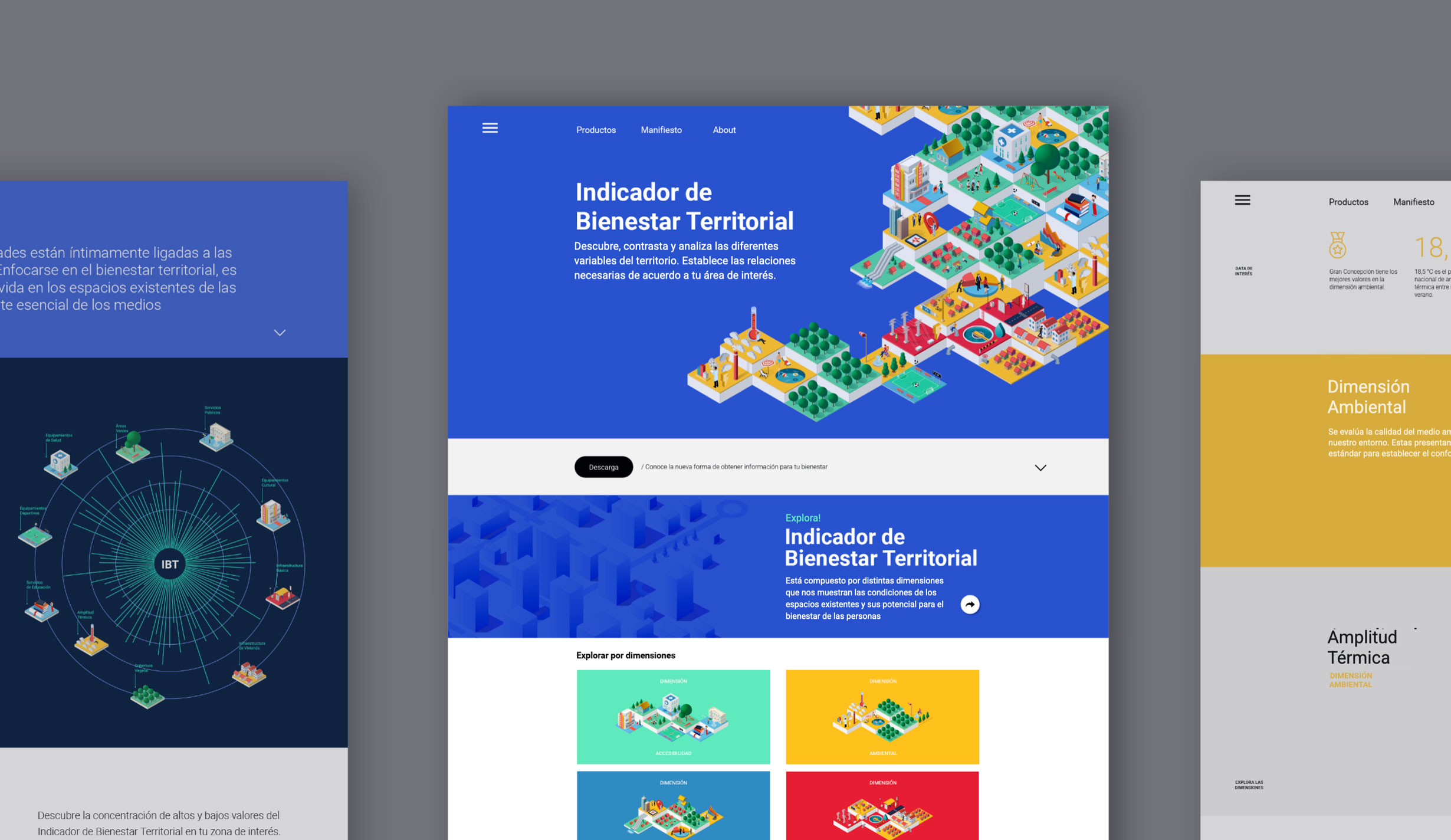
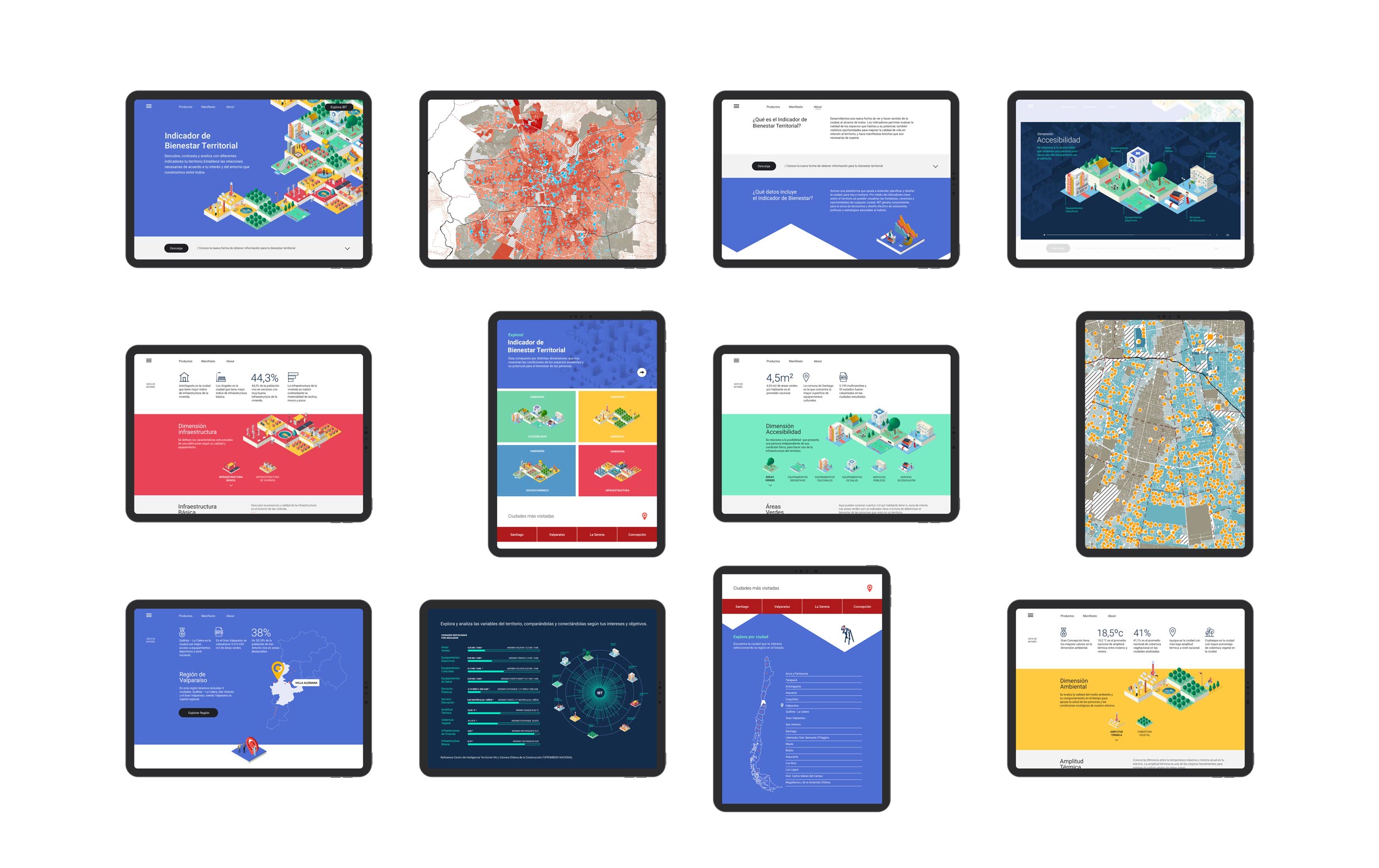
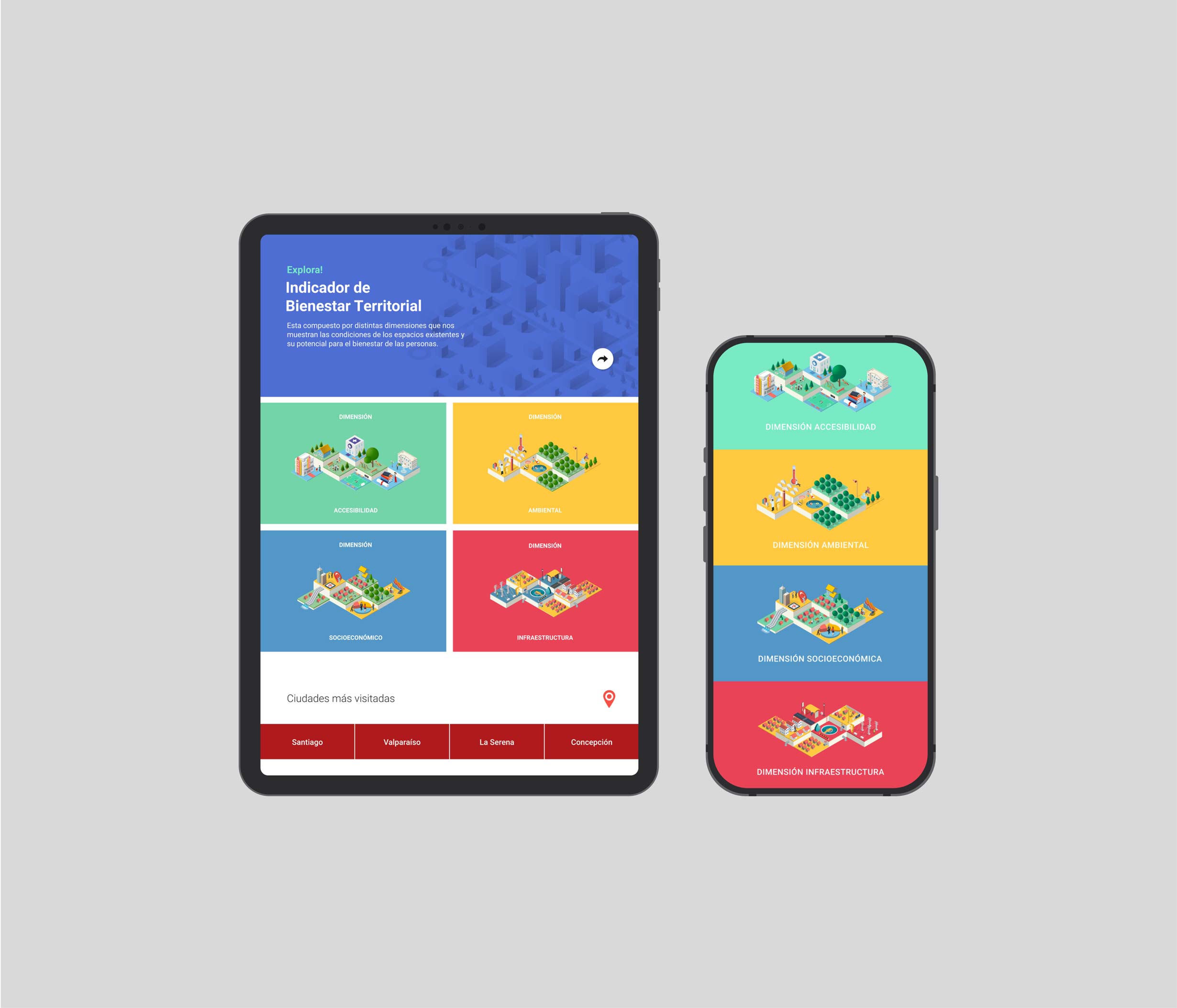
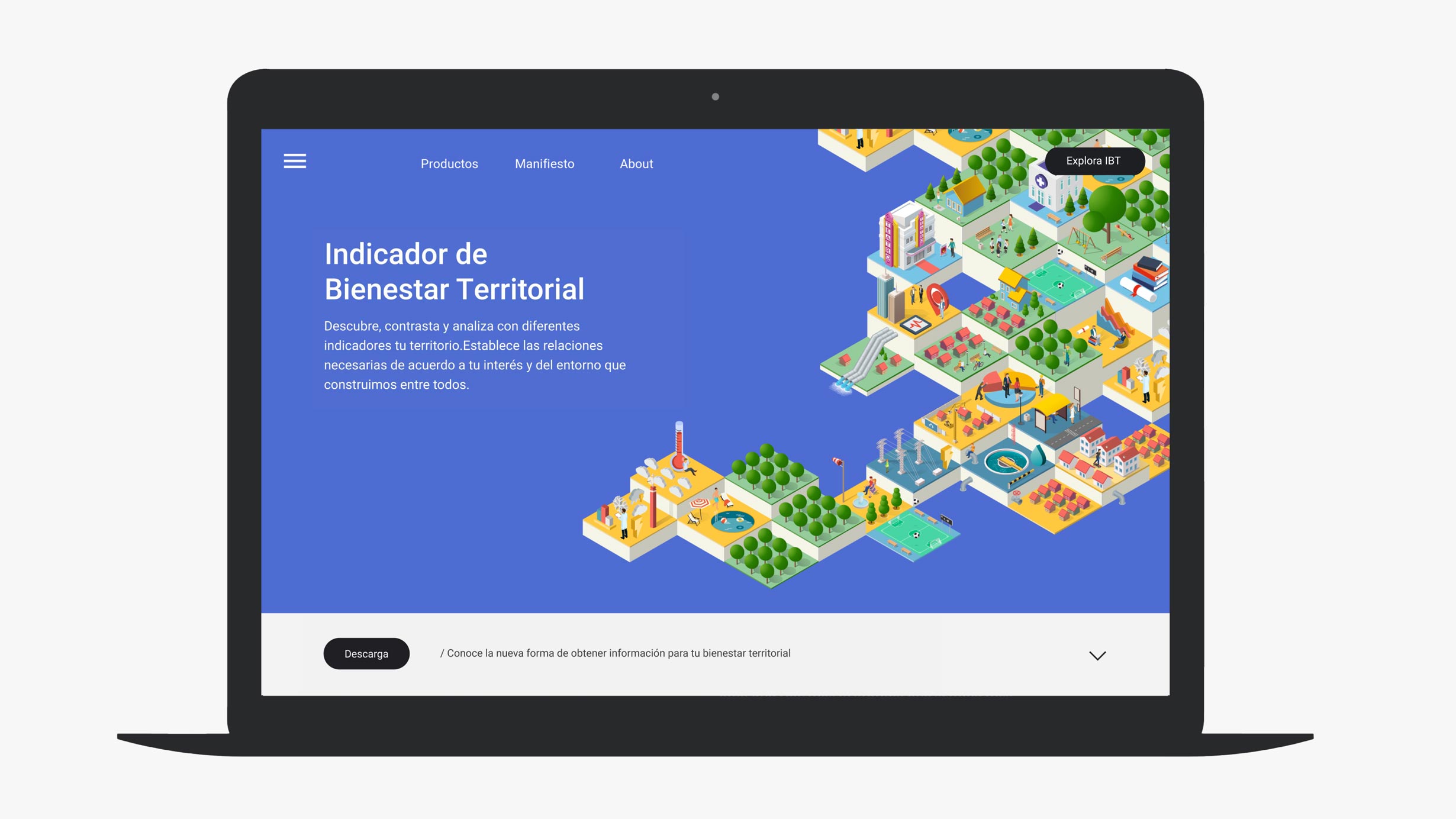
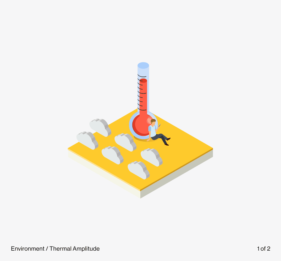
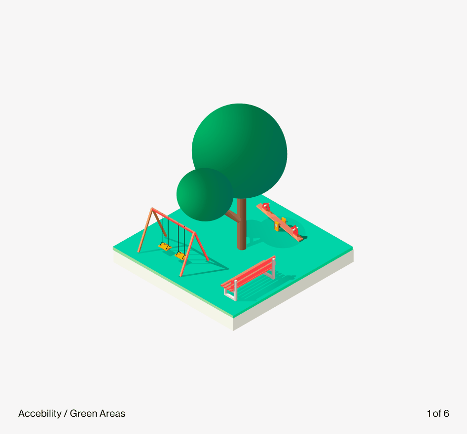
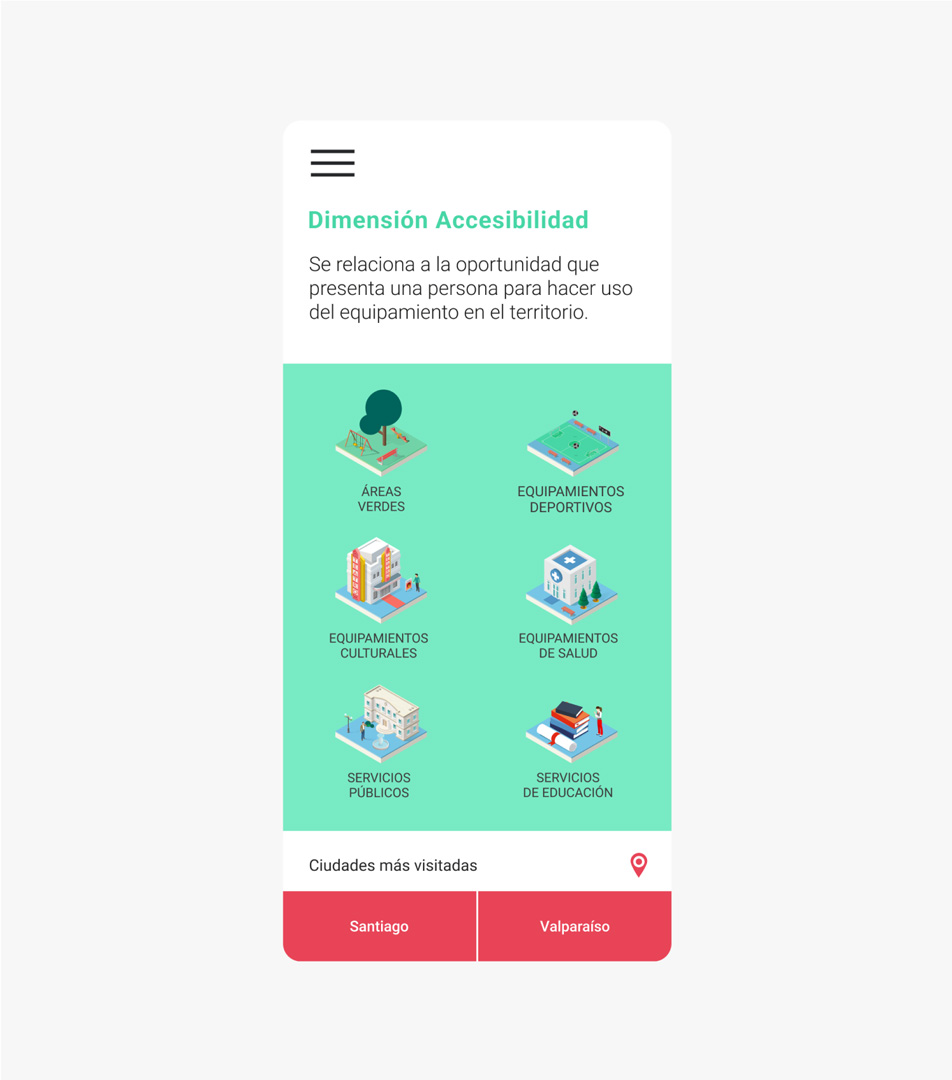
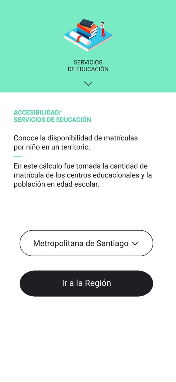
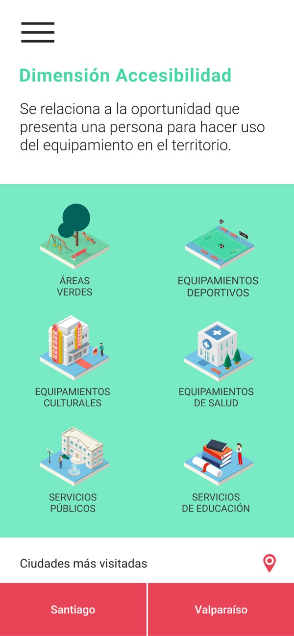
I proposed a visual narrative that made data more understandable and engaging. I used 3D isometric elements to represent territorial layers and facilitate exploration. The idea was to make the information approachable for non-experts, sparking curiosity and guiding interaction with a clear, warm, and accessible interface.
Designing structure and user experience
I organized territorial navigation into a stepwise structure (country, region, municipality, block), respecting the logic defined by CIT-IBT. My focus was to make the information more legible and actionable without losing depth. I unified design criteria across screens to ensure a coherent, clear, and easy-to-navigate experience.
Leading implementation from design
I acted as the link between design, client, and engineering. My responsibility was ensuring that what we designed not only looked good, but could also be implemented, scaled, and sustained over time, while also considering technological constraints (e.g., map loading on mobile connections).
Design Decisions
Turning complexity into comprehension
Designing IBT meant working with what already existed: a highly technical system, diverse institutional teams, and users with very different needs. These decisions were not made from a blank slate, but from the challenge of making something understandable, useful, and realistic.
Clear territorial hierarchy
I designed a content tree that organized navigation across geographic scales, making territorial exploration more intuitive.
Integration with Leaflet
I adapted the design within an existing platform, enhancing the user experience without compromising the technical logic of the original system.
Designing for real contexts
I made conscious visual decisions to ensure performance in municipalities with low connectivity and basic institutional equipment.
Color as a strategic choice
I deliberately avoided a fully chromatic map/indicator system, prioritizing other design needs and anticipating future technological migration.
Collaboration & Validation
Iterate & co-create
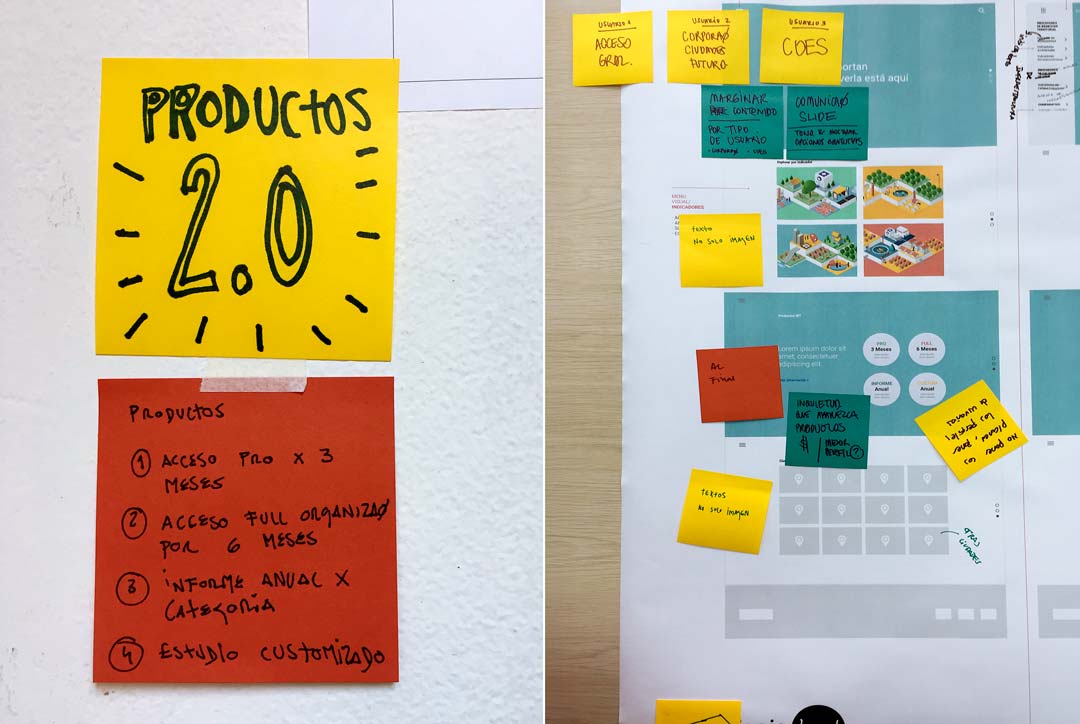
Interactive prototype v.1 / Co-creative workshop
Throughout the project, I worked collaboratively with the CIT-IBT team: urban planners, developers, sociologists, geographers, and GIS specialists. From design, I articulated the dialogue across these disciplines so the experience not only represented data but also enabled real decision-making.
In regional seminars, the platform was tested by mayors, public officials, and community actors. Direct feedback allowed us to adjust navigation paths, simplify terms, and reinforce key visual elements.
Some officials highlighted that “for the first time, they could understand the territory in layers”, a powerful validation of our clarity-driven approach.
Impact
From regional launch to international recognition: when design becomes public policy.
The IBT platform was adopted from day one by regional governments and technical teams across the country. It launched with active coverage in seven regions (Ñuble, O’Higgins, Aysén, Maule, Arica, Valparaíso, and Los Ríos), validating not only its institutional relevance but also the clarity of the designed experience: it was possible to use and understand without specialized training.
The tool allowed municipalities and territorial teams to simulate investment scenarios at neighborhood scale. Visualizations helped detect gaps and project solutions based on territorial evidence.
'Seeing how a comprehension-focused interface enabled real decisions in complex contexts was deeply meaningful in my role as a designer.'
Although no formal usability metrics were published, sustained use by non-technical teams and feedback from participatory seminars demonstrated that the design had managed to be inclusive without being simplistic.
This approach was internationally recognized when the project was selected at the Ibero-American Design Biennial (BID18 Madrid), winning the Design for All Award / Fundación ONCE.
For me, this recognition highlighted something central from the very beginning: that design is not only about making the complex visible, but making it legible—putting it within reach and turning it into a real tool for informed decisions. Because accessibility is also about democratizing information.
Reflection
Key learnings
This project taught me that designing for the public sphere is not only about impact, but also about working under multiple, sometimes contradictory conditions, not all of which are within your control.
I was able to make key UX and UI decisions, but also witnessed first-hand the tensions between vision, resources, time, and expectations.
In this first version, we prioritized a fluid experience and a cognitive aesthetic that encouraged exploration. Looking back, I would have placed greater emphasis on distinct user profiles, designing more guided journeys tailored to concrete tasks. Tools like journey maps would have helped align the experience more closely with project goals.
I would also have liked to be more involved in user insight collection and validation. Project urgencies limited those opportunities, but I came to understand that defending user validation moments, even under pressure, is part of the ethical responsibility of design.
Throughout the process, I realized how crucial it is to accompany visual decisions with a clear narrative. Explaining for whom you design, how it is used, and why decisions are made is as essential as the interface itself.
Working on top of an existing technical base also meant embracing limits. Some ideas had to be set aside, and certain screens adapted. I learned that being solution-oriented is not about giving in thoughtlessly, but negotiating without losing meaning.
In terms of accessibility, we managed to open up previously over-technicalized information, but more work remained: simplifying language, rethinking representational logic. A public product is always evolving, and continuous improvement is part of the commitment to inclusion.
I close this reflection acknowledging that this project helped me better understand what I really do: I don’t just design screens, I design access. Leading this experience taught me how to translate complexity into comprehension, and data into decisions with purpose.
Keep exploring

Missliv
Listen, Design, and Make an Impact.
Sptfy
Prototyping collaborative meetings
IBT Platform
Reading the territory to make better decisions