High-Fidelity prototyping
Designing for collaboration – a space booking App for Spotify

Scope
Concept prototype
Interaction Design
Visual System
Flow Scenarios
Prototyping
User Testing
At Spotify, music brings people together. But what about the meetings that make the magic happen behind the scenes?
This project started with a clear goal: to improve how Spotify teams find, book, and use their collaborative workspaces.
More than just an app, it’s an extension of Spotify’s collaborative ecosystem, a seamless, functional experience aligned with the identity of one of the world’s most influential brands.
How can an app enable creative encounters at the right time, in the right place, with the right resources to strengthen a collaborative culture?
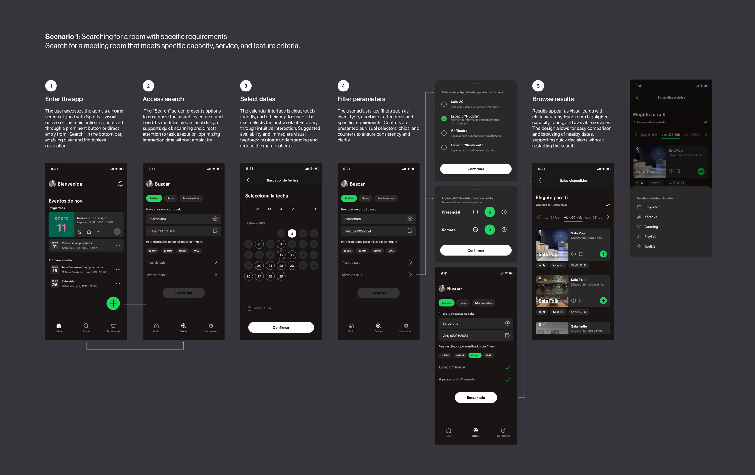
Search and filter meeting rooms based on specific needs.
Buscar y filtrar salas según necesidades específicas.
Search and filter meeting rooms based on specific needs.
Search and filter meeting rooms based on specific needs.
Search and filter meeting rooms based on specific needs.
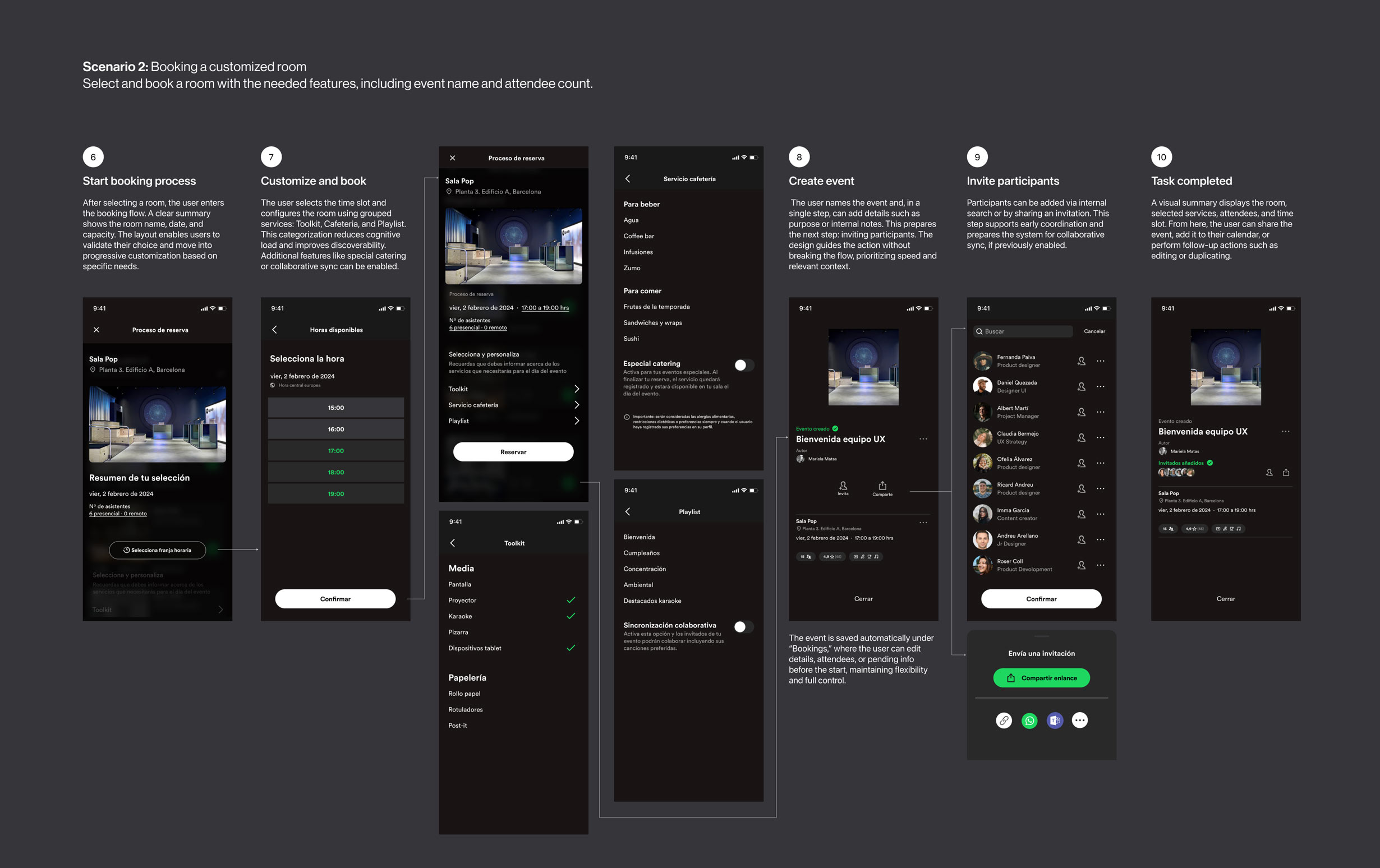
Customize bookings by adding attendees and technical resources.
Personalizar reservas con asistentes y recursos técnicos.
Customize bookings by adding attendees and technical resources.
Customize bookings by adding attendees and technical resources.
Customize bookings by adding attendees and technical resources.
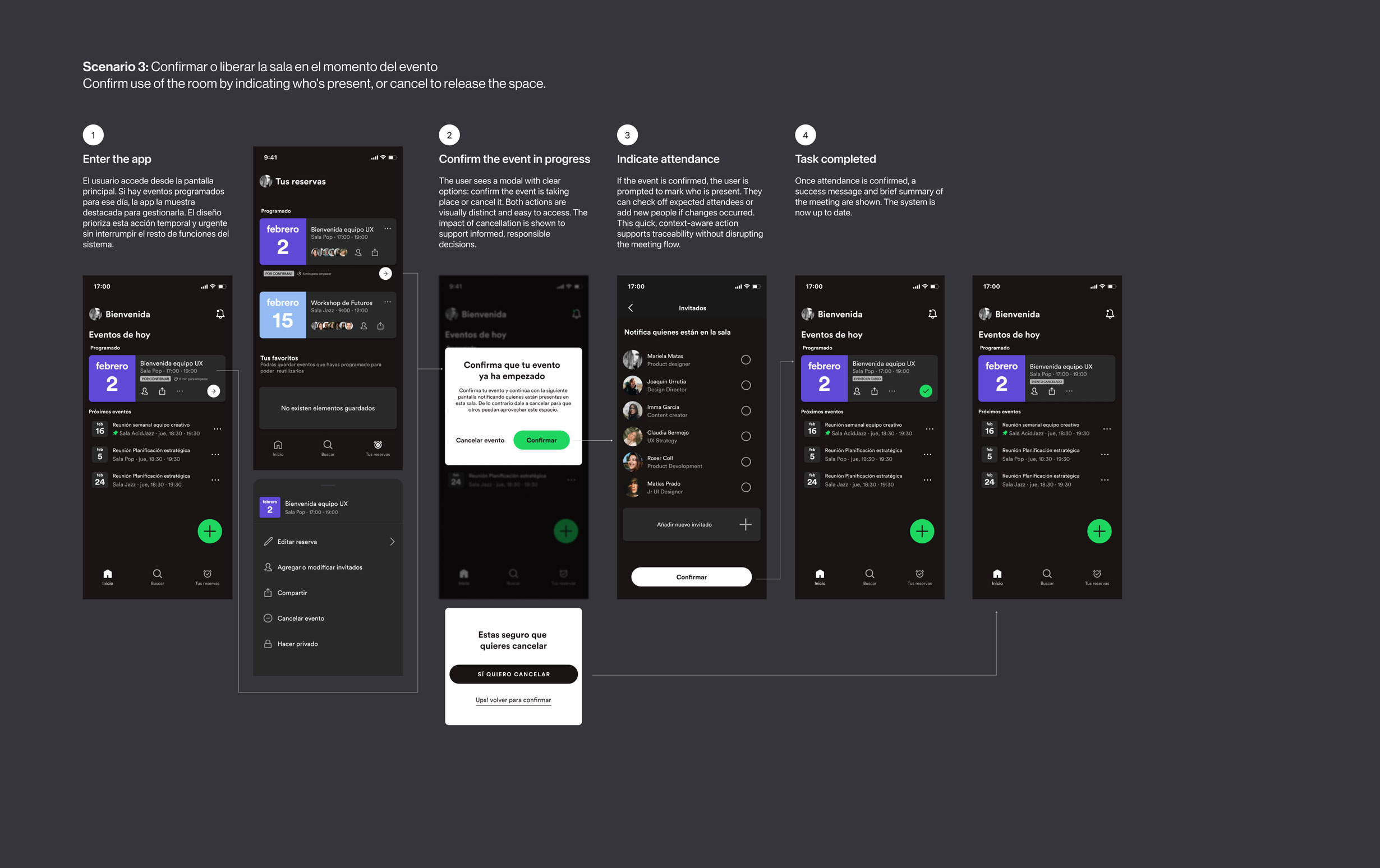
Manage real-time room availability with fast, clear actions.
Gestionar la ocupación en tiempo real con opciones rápidas y claras.
Manage real-time room availability with fast, clear actions.
Manage real-time room availability with fast, clear actions.
Manage real-time room availability with fast, clear actions.
The challenge was both technical and human: to design an interface that enhances, not interrupts, the workflow.
Design process
Micro-Prototyping: understanding the interface from within
The project began by replicating a minimal flow from Spotify’s playback screen.
This exercise helped me internalize key principles such as visual hierarchy, immediate feedback, and the use of microinteractions.
Audio © 2024 Courtney Barnett. Contains a sample of "Start Somewhere." All rights reserved.


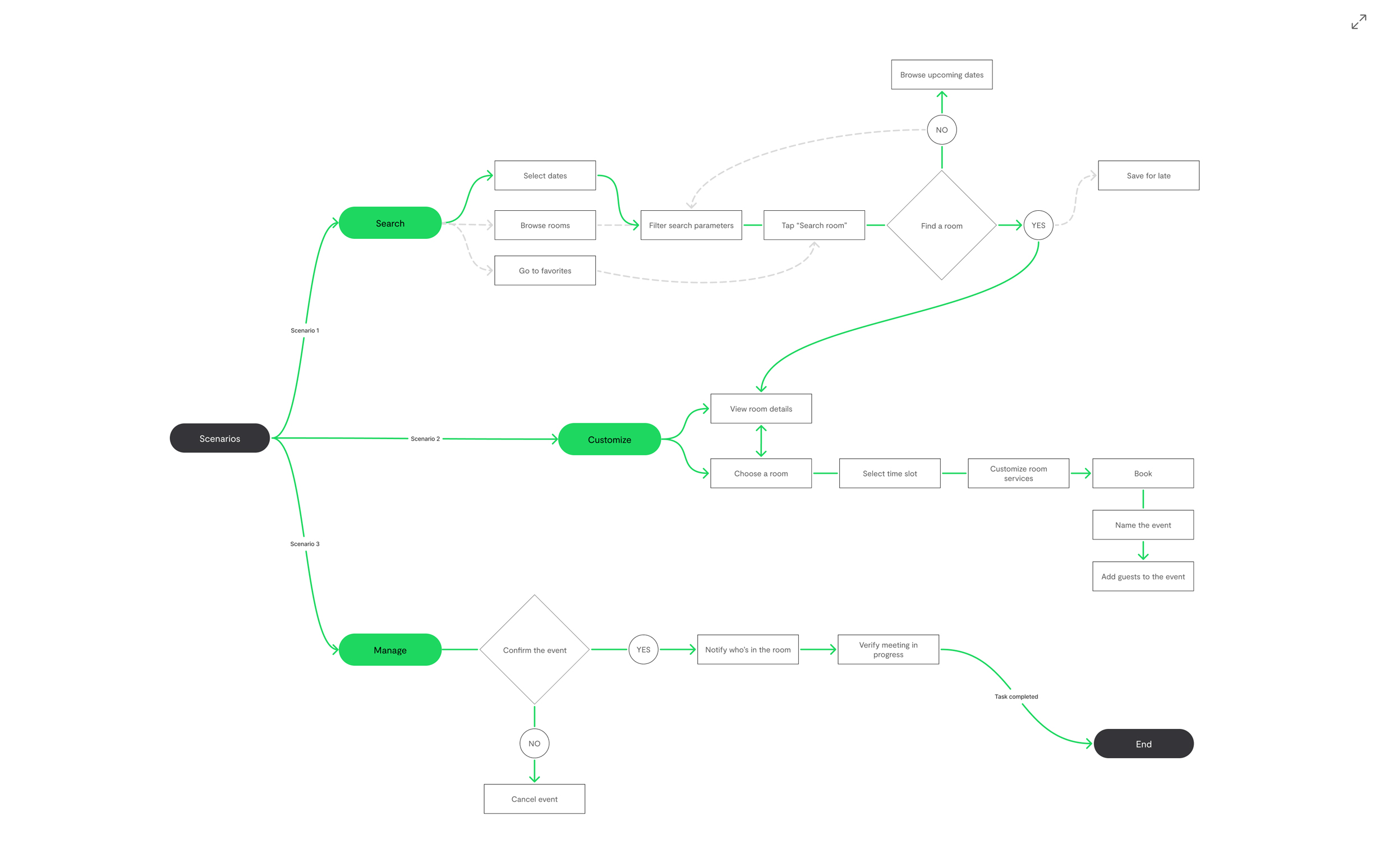
SCENARIO 1
A user searches for a meeting room for a future time slot, with specific requirements such as capacity and features: projector, whiteboard, karaoke, welcome song, lighting, etc.

SCENARIO 2
The user finds a suitable room and books it, entering the number and names of attendees, and confirming the needed features.

SCENARIO 3
At the time of the meeting, the user can confirm they’re using the room, or cancel to release it, while also indicating who is present.
Before mapping out the three scenarios with a more complex flow and realistic fidelity aligned with Spotify’s design language, I chose to start the task at low fidelity. This approach allowed me to quickly explore and identify different paths, stay focused on the user experience, and detect potential issues early, without investing time and resources into fully building out the product.
Replicating to systematize: a technical approach to Spotify’s visual language
I designed an interactive UI Kit based on Spotify’s core styles and components: typography, color, spacing, and interaction patterns.
Applying atomic design principles allowed me to break down the interface into functional units and understand how the brand builds visual consistency.
From that foundation, I developed reusable and scalable components, aligned with the product and ready to support new design flows.
Designing the full flow
With the system in place, I built a high-fidelity interactive prototype based on three key scenarios: searching, booking, and real-time room management.
Improvements implemented after user testing (Thinking Aloud method)


High-Fidelity prototyping
The development of this prototype made it possible to build a solution aligned with Spotify’s internal ecosystem, emphasizing usability, clarity, and personalization. Each scenario was designed with continuity and real-world logic in mind, minimizing friction and supporting the user throughout every phase of the process. This case represents not only a functional design exercise but also an example of how prototyping can act as a bridge, aligning product vision, user needs, and technical capabilities. The result is a system built to evolve alongside teams and their collaborative dynamics.
User Testing
Designing also means listening
Evaluation of three key tasks based on the defined scenarios
Objetive:
Identify real friction points in the flows for searching, booking, and confirming a meeting room.
Method:
Thinking aloud (users speak their thoughts while using a prototype to highlight usability issues).
Participants:
5 Spotify app users.


FINDINGS
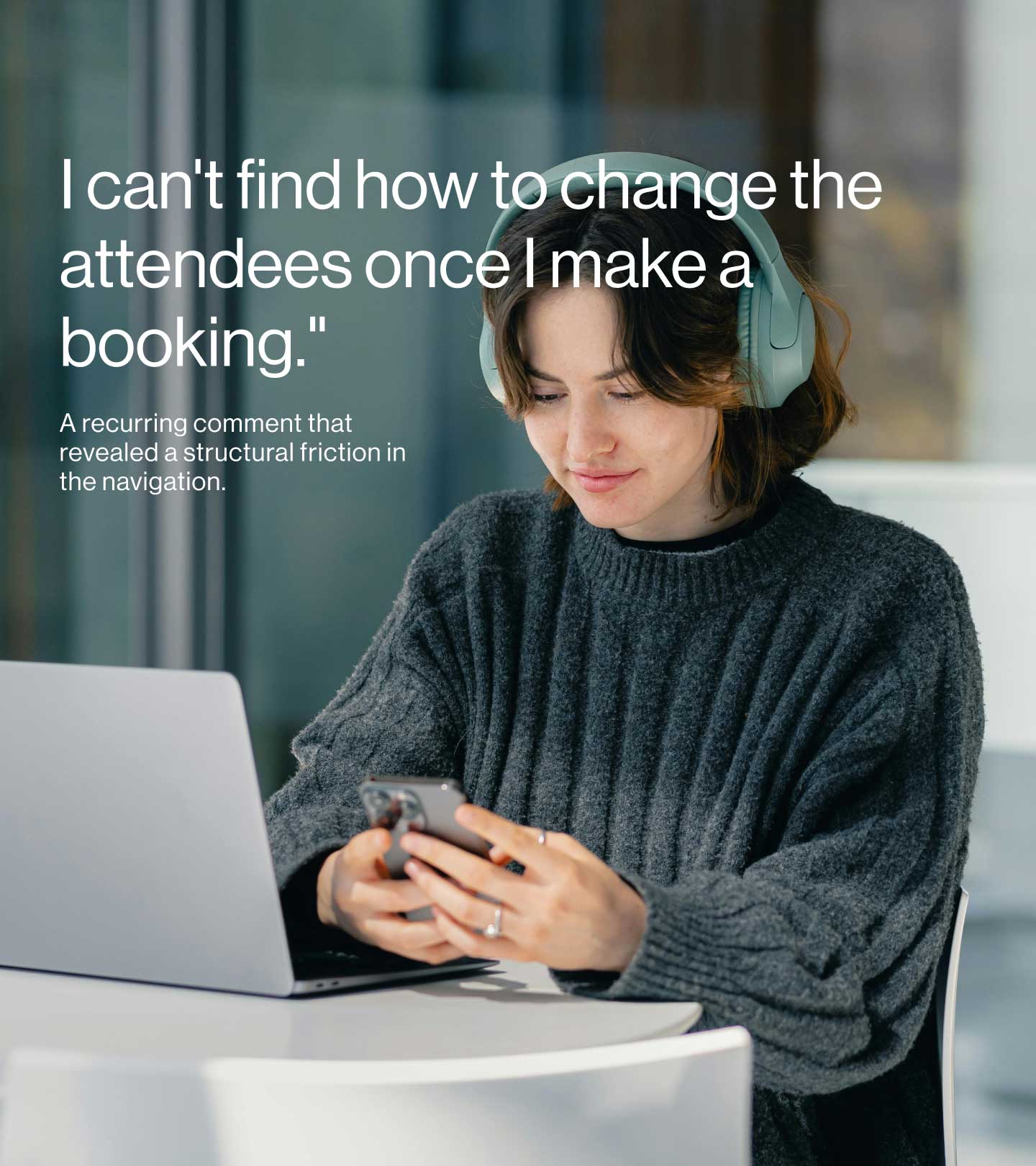
During the testing sessions, the most significant friction was the lack of confirmation after completing key actions. When selecting attendees or setting a time slot, users didn’t receive clear signals to validate their decisions. This absence of feedback caused uncertainty about whether the action had been processed correctly, especially when returning to previous screens. Another critical issue was ambiguity around when and where to configure the meeting time, revealing the need for a more intuitive and flexible structure. Additionally, the flow included redundant steps that slowed the experience and reduced its overall efficiency.
SOLUTION
Based on these insights, the iterations focused on improving system–user communication. Confirmation buttons were added at key decision points, along with contextual messages indicating the current status of the action (e.g., an icon or feedback message after confirming a room or time). The flow was streamlined by removing unnecessary steps, and the calendar was redesigned to clearly differentiate available vs. booked slots through a more intuitive color-coding system. (These improvements are shown in the section “Designing the Full Flow”)
REFLECTION
This experience highlighted a key lesson: familiarity doesn’t replace clarity. Relying on familiar patterns doesn’t guarantee that users know what to do (gulf of execution) or whether they did it successfully (gulf of evaluation), as Donald Norman’s model reminds us.
Assuming users understand how something “should work", especially on a familiar platform like Spotify, can lead to bias. Design must account for a variety of mental models, validating every interaction and ensuring the system speaks the user’s language. Adding confirmations, visual feedback, and clear paths is more than best practice, it’s a way of showing respect for the people using the product.